Introducing the Markup Usage Analytics Dashboard
 •
January 21, 2026
•
January 21, 2026

Scaling AI across an enterprise is no longer just about adoption—it’s about management, predictability, and operational efficiency. As your teams rely more heavily on Content Guardian Agents℠ to scan, score, and rewrite content, understanding the velocity of that usage becomes critical. It’s difficult to understand what you need without usage analytics.
We know that for early adopters and operations leaders, “surprise” is a dirty word. You need to know exactly how your resources are being utilized today so you can plan for tomorrow. You asked for deeper visibility into your token consumption, and we listened.
We are excited to introduce the Markup Usage Analytics dashboard.
This new feature set, located directly within your console, provides a transparent, real-time window into your account’s activity. It transforms raw data into actionable insights, helping you budget better, plan accurately, and ensure your teams always have the capacity they need to keep moving fast.
In this guide, we’ll walk you through the new dashboard, explain how to interpret your data, and show you how to use these insights to optimize your AI strategy.
The importance of usage visibility
Before we dive into the specific features, let’s look at why usage analytics matter for a modern content operation.
When you integrate Markup AI into your workflows—whether via API or our platform—you aren’t just “checking text.” You are enforcing brand standards, ensuring compliance, and rewriting content at scale. This activity burns tokens.
In the past, understanding your burn rate might have required manual calculations or waiting for a billing statement. That approach doesn’t work when you are trying to be agile. If you are planning a massive content migration or a new product launch, you need to know now if you have the token bandwidth to support it.
The new Usage Analytics dashboard solves three core challenges:
- Budget certainty: No more guessing if you are over- or under-utilizing your plan.
- Capacity planning: Predict when you will need more resources before you run out.
- Workflow optimization: Identify spikes in activity to understand when your team is most active.
Accessing your new dashboard
Getting to your data is simple. We have integrated the analytics directly into your existing workflow so you don’t have to hunt for the numbers.
- Log in to your Markup AI console.
- Navigate to the Reports section in the main menu.
- Click on Usage Analytics.
Once you are there, you will be presented with a clean, visual interface designed to answer your most pressing questions at a glance. Let’s break down the data available to you.
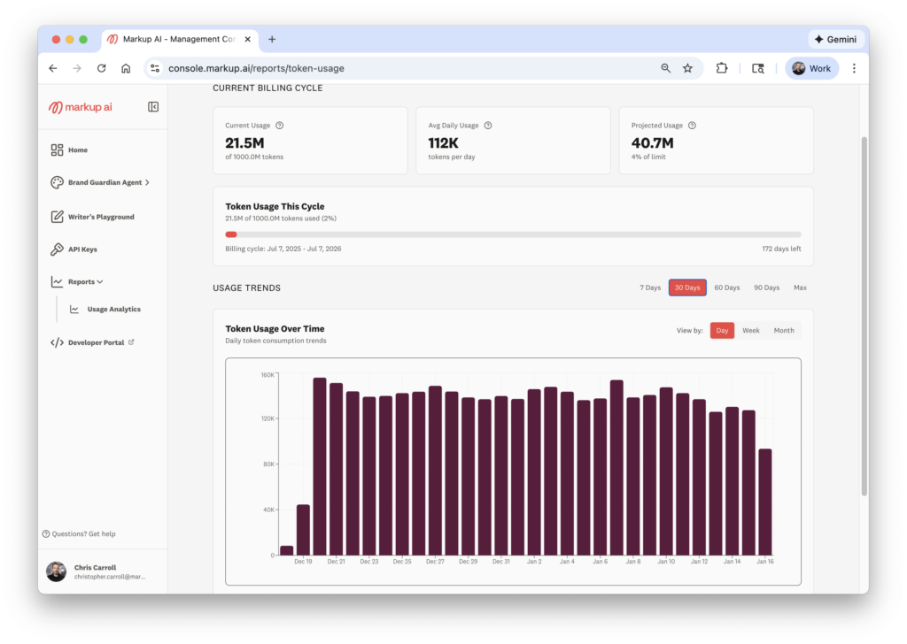
Real-time token tracking
The first thing you will see at the top of the dashboard is a snapshot of your current reality. We believe in radical transparency regarding where you stand in your billing cycle.
Current billing cycle usage
This metric shows you the total amount of tokens you have used in your current period.
- For annual plans: You will see your cumulative usage across the year. This helps you pace your consumption to ensure you don’t burn through your annual allocation in the first six months.
- For monthly plans: You will see exactly where you stand for the current month.
Daily average usage
Below the total, we provide an average of the tokens your team consumes every day. This number is vital for establishing a baseline. Once you know your “normal” daily volume, it becomes much easier to spot anomalies or trends.
For example, if your daily average is 10,000 tokens, but yesterday you used 50,000, you know something significant happened—perhaps a bulk scan of a legacy documentation library or a heavy day of rewriting marketing emails.
Forecasting with projected usage
Data is useful, but predictive data is powerful. One of the most requested features from our enterprise customers was the ability to look ahead.
The dashboard now calculates an Average Amount of Projected Use. This algorithm looks at:
- How many tokens you have used so far.
- How far along you are in your contract term.
- Your current usage velocity.
It then projects where you will land at the end of your term.
Why this matters
This feature is your early warning system. It answers two critical questions:
- “Are we going to run out?” If the projection shows you exceeding your cap, you can contact your account manager early to top up, ensuring no interruption to your Content Guardian Agents.
- “Are we buying too much?” Conversely, if the projection shows you will only use 50% of your purchased tokens, you have an opportunity to optimize. You might decide to deploy Markup AI to more teams to get full value from your investment, or you might adjust your plan at renewal.
Visualizing trends and trajectories
Static numbers tell part of the story, but trends tell you about your business. The new dashboard includes a robust Usage Trends visualizer.
You can toggle this view to analyze data over different time horizons:
- Last 7 days
- Last 30 days
- Last 60 days
- Last 90 days
- All-time usage
You can also adjust the granularity of the graph to view by day, week, or month.
Identifying spikes and valleys
This visual representation helps you correlate token usage with business activities.
The Spikes: You will likely see sharp increases in usage on the graph. These “spikes” usually correlate with major initiatives.
- Example: A developer team running a massive regression test on API documentation.
- Example: A marketing team rewriting a year’s worth of blog posts for a rebrand.
- Action: Use these spikes to plan. If you know a similar project is coming up next quarter, you can look at the historical data to estimate exactly how many tokens that project will require.
The Valleys: Periods of low usage can also be insightful.
- Example: Weekends or holidays (expected).
- Example: A drop in usage during a work week might indicate a bottleneck elsewhere in your content pipeline, or perhaps a team isn’t adopting the tool as expected.
- Action: If usage drops unexpectedly, check in with your teams. Are they bypassing the guardrails? Do they need more training?
General usage analytics insights
At the bottom of the dashboard, we provide a summary section called General Usage Insights. This is your high-level executive summary, perfect for reporting up to management or finance.
This section highlights:
- Peak volume: The maximum number of tokens used in a single day. This helps stress-test your capacity planning.
- Lowest usage: The minimum volume day.
- Total utilized: The aggregate count for the selected period.
Transparency builds trust
At Markup AI, our mission is to help you scale AI confidently. Part of that confidence comes from knowing you are in control of your resources.
We designed the Usage Analytics dashboard to remove the black box around AI consumption. Whether you are scanning snippets of code or rewriting entire libraries of technical documentation, you deserve to know the cost and impact of those actions in real-time.
This release is just the beginning. We are committed to providing you with deeper insights into how your content quality improves over time and how your specific guardrails are performing. But for now, we want to ensure you have the foundational data to manage your account effectively.
Ready to see your data?
The dashboard is live right now. We encourage you to log in, explore the trends, and share the insights with your team.
If you see a trajectory that suggests you need more tokens—or if you simply want help interpreting your spikes and valleys—our team is here to help. Reach out to us in the community or contact support.
Let’s keep building, scaling, and optimizing.
Key takeaways
- New dashboard location: Access the Usage Analytics dashboard under the “Reports” tab in your Markup AI console.
- Track current status: View real-time token usage for your current billing cycle (annual or monthly).
- Forecast with confidence: Use the “Projected Use” feature to predict if you will run out of tokens or have a surplus by the end of your term.
- Analyze trends: visualize usage over 7, 30, 60, or 90 days to identify workflow spikes and dormant periods.
- Optimize planning: Use data to adjust your purchasing decisions, optimize team workflows, and debug API integrations.
Frequently asked questions
Who can see the Usage Analytics dashboard? Any user with administrative or reporting access to your Markup AI console can view the analytics screen. This ensures that ops leaders, finance teams, and managers have the visibility they need.
Does the dashboard show usage for specific Content Guardian Agents? Currently, the dashboard shows aggregate token usage for the account. We are working on future updates that will provide more granular breakdowns by specific agents or projects.
How often is the data updated? The data in the dashboard is near real-time. You can rely on it for up-to-date tracking of your daily and weekly consumption.
What should I do if my projected usage is much higher than my plan allows? If your trajectory shows you will exceed your token limit, we recommend contacting your account representative immediately. We can discuss adding a token pack or upgrading your plan to ensure your teams don’t experience any interruption in service.
Can I export this data? While the current view is designed for on-screen analysis, you can easily screenshot the “General Usage Insights” or trend graphs for internal reporting. We are exploring export functionality for future releases.
Last updated: January 21, 2026
Christopher Carroll
Continue reading

Safety First: Implementing Generative AI Guardrails for Enterprises
 •
March 20, 2026
•
March 20, 2026


Get early access. Join other early adopters
Deploy your Brand Guardian Agent in minutes.